A quieter signature
The anonymous metch collective.
We want a piece to have presence without asking it to speak at full volume from every angle.
Learning to look
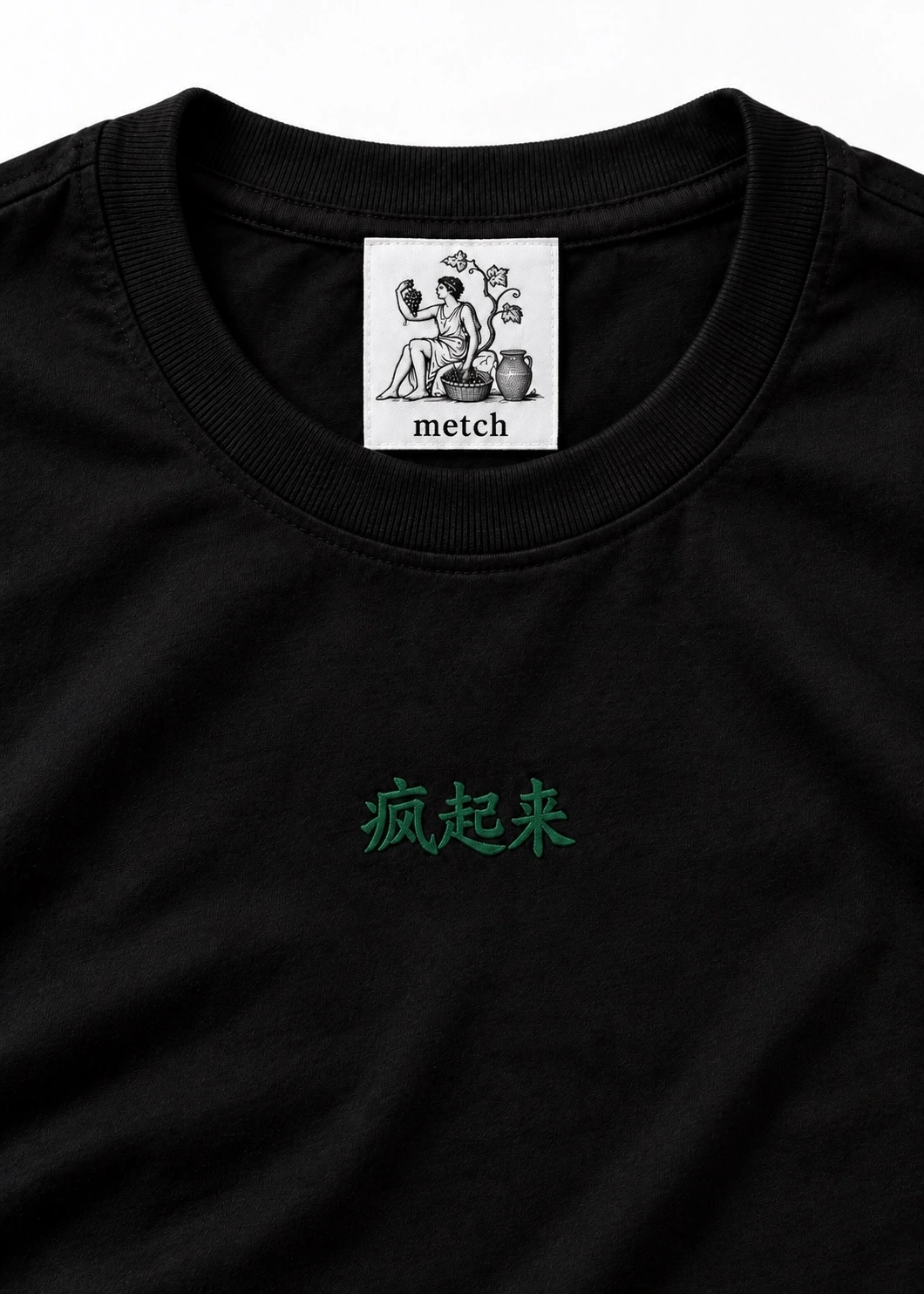
Travelling brings small differences into focus. A familiar colour appears beside something unexpected and suddenly feels different. The background changes the meaning of the mark. That relationship interests us more than using a place as a decorative theme. In the Black signature tee, the question is simple enough to see immediately: what happens to the metch green when the ground around it becomes black? It becomes quieter at first glance. Give it more attention and its character begins to emerge. The design asks the eye to come closer rather than filling the whole surface with a demand.
Black gives a garment a clear identity before any artwork is added. It can hold many associations at once, depending on the person wearing it and the setting around them. We like working with that openness. The green lettering at the chest does not have to turn the tee into a complete explanation of the collection. It can act as one small point of recognition. The surrounding dark belongs to the design as much as the mark does. What is left unoccupied has a role. It gives the eye a way to understand the scale of the thing we have chosen to place there.
Two views of a mark
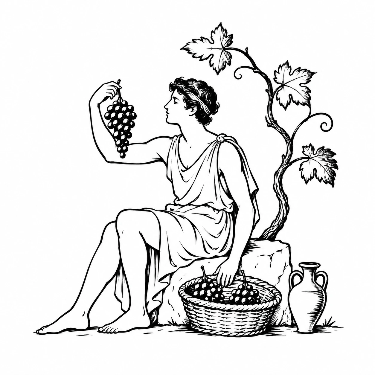
The harvest emblem appears low on the back. That position gives the reverse its own moment of recognition. Someone may notice it as the wearer turns or moves away. We are interested in the way a detail can arrive after the first impression and still feel central to the piece. The chest and the back are not competing for the same moment. They belong to different views of the person wearing the tee. The green connects them, so that the relationship remains clear even though the scale and the placement change. It is the same small world, seen from another side.
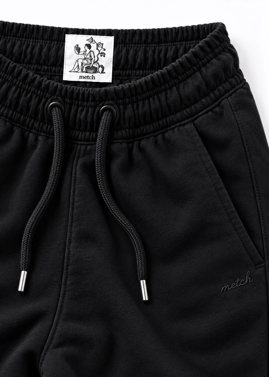
Inside the neckline, the label carries metch into a more private view. A label is often the first thing a person sees when picking up a garment and one of the last things visible once it is being worn. That change of audience matters to us. The outside meets other people. The inside belongs first to the wearer. We want the piece to have a coherent character across both experiences. The green keeps the lettering connected to the other signatures, while the black gives each view its own sense of space.
The space around it
The work of considering a restrained design is easy to overlook because the finished surface contains fewer elements. We look at the distance around a mark, its relationship to the neckline and the effect of its colour against the ground. A small change in one relationship can alter the impression of the whole. We want you to be able to see that reasoning in the garment itself, through the relationship between a mark and the room around it. The chest lettering, the lower back emblem and the label each occupy a different kind of space, with the black holding the piece together.
This tee expresses a part of metch that is comfortable being discovered gradually. Our anonymity follows the same approach. There is no public artist identity supplied as a shortcut to importance. The piece has to find its own place with the person who chooses it. Perhaps you notice the green first. Perhaps you recognise the harvest scene only after wearing it for a while. A design can develop familiarity without surrendering all of its interest at once. We like that kind of relationship: clear enough to recognise, open enough to keep looking at, personal enough to gather something of your own.